Source: Artplacer.
You just moved your art online and now you want your Instagram profile to look like an online art booth. This is peak modernity because in this case, anyone’s content can achieve viral status and high engagement rates, bringing in millions of views, and thousands of likes. It has never been easier to market one’s art, as the audience is always just a click away from your page, is all a matter of strategy.
So, how do you get started in setting your artist’s Instagram profile, and how do you ensure your feed is engaging enough to captivate trigger-happy Insta audiences? Here is a list of tips and enhancements you can apply to your profile to have an engaging and like-worthy Instagram account.
Want to access more downloadable assets, plus, hours of recorded webinars, live events, interviews, tutorials, and how-to guides? Visit ArtPlacer Academy. Log in to your ArtPlacer account or start your free trial to visit this learning space for artists, curators, and gallerists.
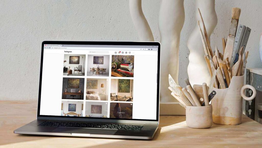
Instagram feed of @amavydesign .
Set your account (and yourself) up for success
Face-to-face is a concept of an older age; on social media, you are represented first by your username, and second, by your bio. Make them count.
Your username should be memorable, and as simple as possible. Ultimately, it should reflect who you are as an artist, not as a person. Your name might suffice, but here’s the trick… @JohnDoe can be anyone who does anything, but @JohnDoeArt tells audiences exactly what your page is about from the start, and thus, will attract exactly who you are looking for, those interested in your art!
When it comes to your bio, keep it short and sweet. Important information that you want to be center stage on your account? Add it, but remember, you want your art to be the focus… so don’t overdo it with personal details. When editing your bio, take advantage of the “website” option to link any pertinent work, articles, or even virtual exhibitions!

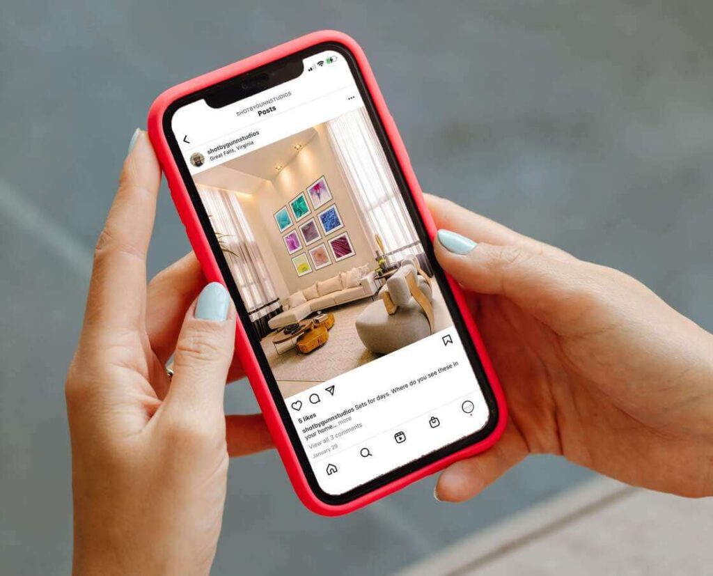
Elijah’s photo on his Instagram: @shotbygunnstudios
Engaging Content!
When it comes to your actual content, I, as an avid Instagram user, can tell you what gets the most views (and here’s a spoiler, sometimes it’s not even the finished piece!).
Some of the most liked and viewed art content on Instagram at the moment (and by that I mean with millions of interactions) are sped-up renditions of an artist’s process working on a piece. Users enjoy viewing things that maybe wouldn’t be feasible for them, or that demonstrate displays of talent.
Because of this, sometimes a time-lapse of an oil painting might gain more likes than just a picture of the work, simply because of the background the video provides. Factors like time, effort, and expertise are much easier to measure and appreciate when there is the option to experience the process with you.
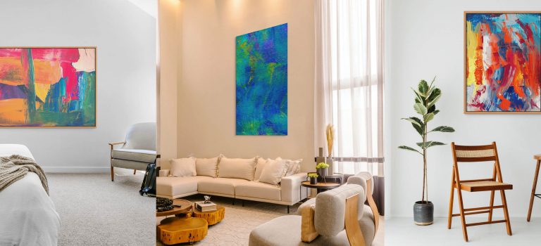
Here is where we come into play. ArtPlacer’s Room Mockups is a very “instagrammable” feature. Art becomes displayed in a setting away from the phone screen. Instead, this allows viewers to visualize the way an artwork can work in a space, especially in terms of proportion. In fact, this is already ArtPlacer’s most popularly used tool in developing more engaging and informative media spaces. All that needs to be done is drag and drop your artwork into a room of your choosing, and boom, you add context to your space.
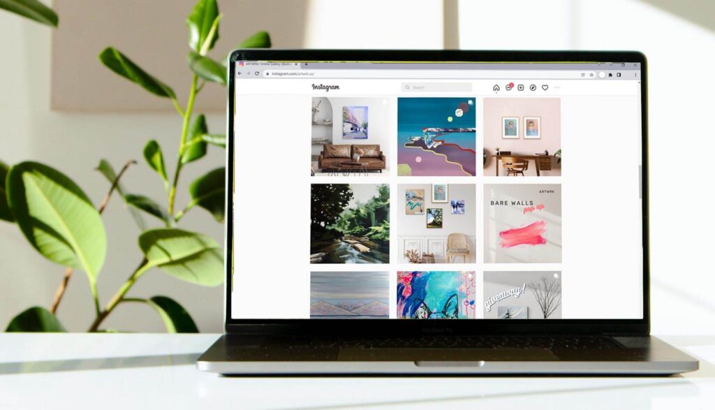
Room Mockups on @artwrk.ca‘s feed
Center your art
No one likes a cluttered feed. Nor one that is blurry or out of focus. When setting up a photo to post, make sure your art is central and your space clear, unless you are trying to show a little behind-the-scenes studio action.
Like an art exhibition, it is preferable to have a cohesive Instagram feed. With that in mind, maybe each commitment to a work or collection merits a theme that can be translated to Instagram. The theme can be represented with colors, the same way as a palette, or with content that links to one another. This also creates a more positive viewing experience.
Finally, context is important, and sometimes a picture is not worth 1000 words. Luckily, you have your caption space to make up for that! Your followers are interested in your work, and not just its physicality, so adding captions is a great way to get descriptive and informative about the work featured in your latest post.

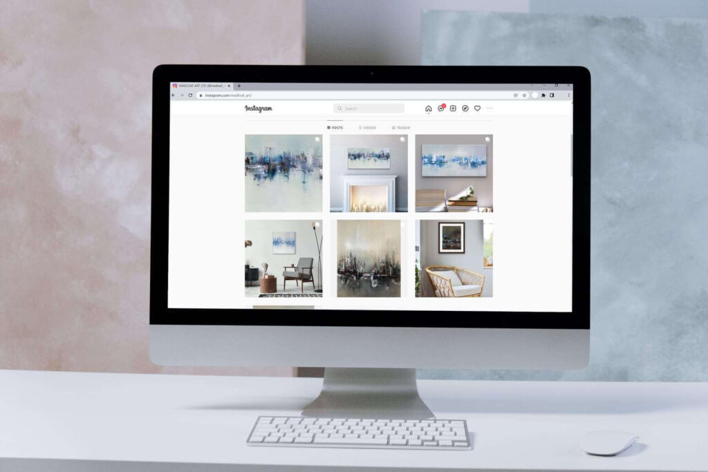
Madeline Sunter’s artwork digitally placed on a room
Engaging with others
Face it, word of mouth is no longer, well, face-to-face…Here’s how you use that to your advantage:
- Use #Hashtags to increase content viewing from users interested in what you offer!
- Shoutouts and interactions with other creators and artists are great ways to make connections and gain a larger viewer pool, so don’t be afraid to reach out. These can be done over Instagram stories or posts!
- Contact your audience, it brings personability. For example, if a user comments on your post a compliment about your work, feel free to tap the reply button and keep the conversation going.
Bringing it all together
Sometimes, Instagram can feel like a minefield of possibilities. As artists and designers, take it to heart when I say that curating an Instagram account requires the same skills used to create your artworks. You know what people like to see, and what you like to create, now it’s just time to take it one step further onto social media.
So get started! Download Insta, set up your account, and begin interacting with audiences and creators. As a final step, you can subscribe to ArtPlacer’s free trial and experiment with how our room mockups can diversify your feed!
